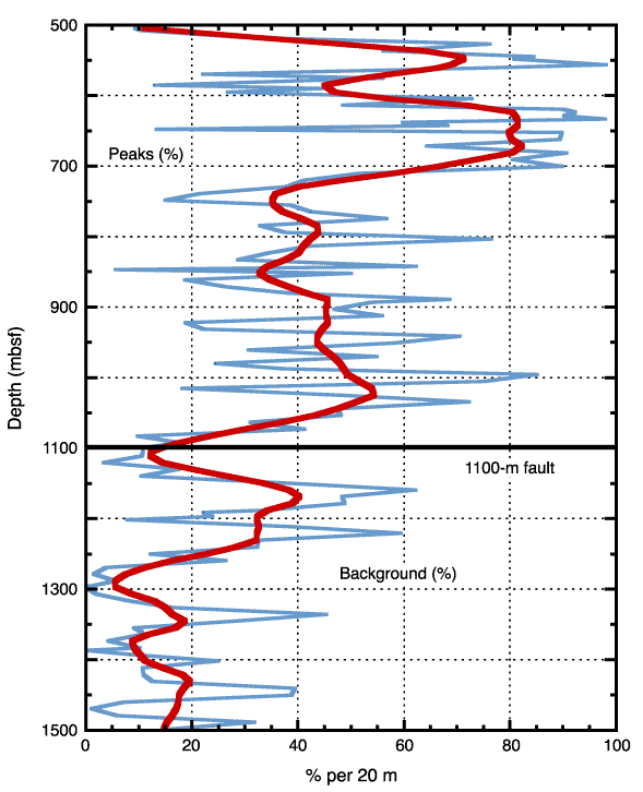
Figure F9. Percent of measurements of peaks and peak regions of magnetic susceptibility per 20-m interval vs. depth (thin line) from 500 to 1500 mbsf. This divides the plot into percent peaks (left) and percent background measurements (right). The thick curve smoothes the data over 10% of the data (200 m).