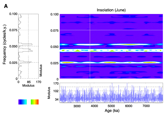
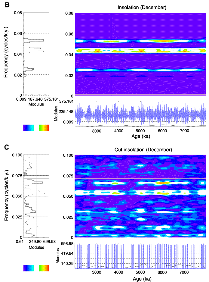
Figure F11. Spectral map for (A) the June insolation signal. The horizontal and vertical axis represent, respectively, the age and the frequency. The color scale goes from blue (high negative modulus, which corresponds to a trough in the signal) to red (high positive modulus, which corresponds to a peak in the signal). Note that we modified the modulus color scale to eliminate the nonstatistically significant wavenumbers (see Torrence and Compo, 1998). For that, we attributed the white color to the low modulus absolute values. The modulus part is represented here. The diagrams on the left display the modulus of the wavelet transform vs. frequency; frequency for a chosen depth specified on the spectral map by a vertical gray line. The diagram under the map displays in blue the processed signal. (B) December insolation signal and (C) insolation signal truncated at 510 W/m2.