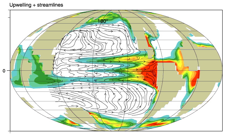
Figure F1. Global land-sea distribution and annual average map of upwelling into the thermocline. Red = regions of vigorous upwelling, green to blue = regions of weak upwelling, white = areas of mean downwelling. Current streamlines at ~100 m are shown for the Pacific. All map views are projected on a Mollweide projection.